Introduction
Throughout the duration of this course, a lot of image interpretation functions were covered. The goal for this lab was to use four of those functions on images downloaded from the USGS-GloVis site. The four image functions I chose to do include:
-
Thursday, December 14, 2017
Tuesday, December 12, 2017
Lab 8: Spectral Signature Analysis & Resource Monitoring
Introduction
The goal of this lab was to investigate the reflective properties of surface features and various image index functions using ERDAS Imagine. By using a multispectral image of the Eau Claire and Chippewa Falls area, the spectral properties of the following features were studied:
Results
Looking at the spectral signatures of various surface features (figures 9 and 10), the differences in reflectance changed mostly in the blue, red, near-infrared (NIR), and mid-infrared (MIR) spectral bands. As shown in figure 10, dry soil reflects more light than moist soils, specifically in the red band. This is due to the absorption properties of water and could likely also be a reflection of the soil's composition.
Looking at the NDVI and FMI (figures 11 and 12), there are some distinct patterns that are represented by the data. For instance the northeastern half of the image is classified as mostly vegetation in both images. Similarly the cultivated farmlands to the southwest are dominated by ferrous minerals and moisture.
Overall, I found this lab to be an insightful way to learn about differences in spectral reflectances of surface features and a first-hand look at how NDVIs and FMIs are generated using ERDAS; a very powerful software.
Sources
Dr. Cyril Wilson
ERDAS Imagine
ESRI
USGS - Earth Resources Observation and Science Center
The goal of this lab was to investigate the reflective properties of surface features and various image index functions using ERDAS Imagine. By using a multispectral image of the Eau Claire and Chippewa Falls area, the spectral properties of the following features were studied:
- Standing water
- Moving water
- Deciduous forest
- Evergreen forest
- Riparian vegetation
- Crops
- Dry Soil (uncultivated land)
- Moist Soil (uncultivated land)
- Rock
- Asphalt highway
- Airport runway
- Concrete bridge
In addition, a normalized difference vegetation index (NDVI) and ferrous minerals index (FMI) were generated using a multispectral image of the same area.
Methods
Part 1: Understanding Spectral Signatures of Surface Features
By first bringing in the multispectral image of Eau Claire to ERDAS Imagine the various surface features aforementioned were identified in the image. This was done by drawing a polygon within the feature area using the Drawing > Polygon tool (figure 1).
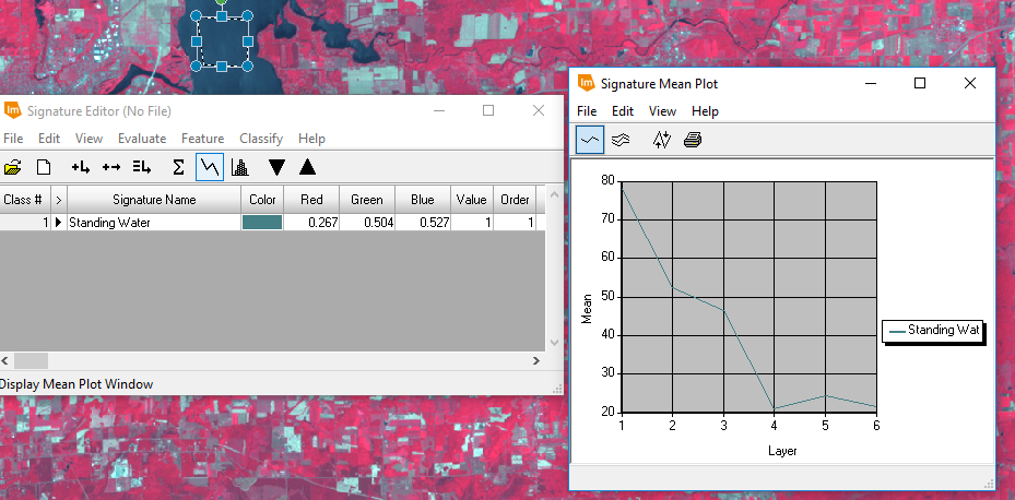
Once the AOI for each feature was drawn, the spectral signatures of each feature were analyzed using the Raster > Supervised > Signature Editor tool (figure 2) and the Signature Mean Plot (SMP) function within the tool (figure 3).
In figure three, the x axis of the SMP window represents the different spectral bands reflected by the surface feature and the y axis represents the mean reflectance within that AOI. Each surface feature's SMP could be visualized individually or with multiple graphs in one SMP window (see results).
Methods
Part 1: Understanding Spectral Signatures of Surface Features
By first bringing in the multispectral image of Eau Claire to ERDAS Imagine the various surface features aforementioned were identified in the image. This was done by drawing a polygon within the feature area using the Drawing > Polygon tool (figure 1).
 |
| Figure 1: Digitizing the area of interest (AOI). |
 |
| Figure 2: Signature Editor Tool. |
 |
| Figure 3: Signature Mean Plot. |
Part 2: Resource Monitoring
For the second part of this lab, a similar multispectral image of the Eau Claire and Chippewa Falls area was used to generate an NDVI and FMI raster. The formula to generate an NDVI is shown in figure 4:
 |
| Figure 4: Formula to generate an NDVI. |
The Raster > Unsupervised > NDVI tool (figure 5) was used to generate indicies for the entire image, rendering more aqueous areas as black and more vegetation cover as white (figure 6).
 |
| Figure 5: Using the NDVI raster tool. |
 |
| Figure 6: Using the Landsat 7 sensor and NDVI index, a new NDVI was generated (see results). |
Next, a similar procedure was followed, only this time, to generate an FMI (figures 7 and 8).
 |
| Figure 7: Formula to generate an FMI. |
 |
| Figure 8: Using the Landsat 7 sensor and ferrous minerals index, an FMI was created (see results). |
 |
| Figure 9: Spectral signatures of all surface features. |
 |
| Figure 10: Dry versus moist soils. |
 |
| Figure 11: NDVI |
 |
| Figure 12: FMI |
Looking at the NDVI and FMI (figures 11 and 12), there are some distinct patterns that are represented by the data. For instance the northeastern half of the image is classified as mostly vegetation in both images. Similarly the cultivated farmlands to the southwest are dominated by ferrous minerals and moisture.
Overall, I found this lab to be an insightful way to learn about differences in spectral reflectances of surface features and a first-hand look at how NDVIs and FMIs are generated using ERDAS; a very powerful software.
Sources
Dr. Cyril Wilson
ERDAS Imagine
ESRI
USGS - Earth Resources Observation and Science Center
Tuesday, December 5, 2017
Lab 7: Photogrammetry
Introduction
The goal of this lab was to become familiar with tasks and practices associated with photogrammetry of aerial photographs. These tasks consisted of developing scales for and measuring aerial photos, calculating relief displacement of features in aerial photographs, creation of anaglyphs for steroscopy, and geometrically correcting images for orthorectification.
Methods
To complete the first task in this lab, scaling and measruing features of aerial photographs, an aerial image of southwestern Eau Claire was used to determine the distance between two points (figure 1).
 |
| Figure 1: Image used for determining ground distance from an aerial photograph. |
To do this, a ruler was used to measure the distance between the points on the computer screen, then using the known scale of the photograph to determine the true ground distance. Next, the area of a lake was calculated using the digitizing function on ERDAS.
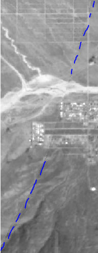
Then, a smoke stack that was warped in an aerial image was corrected by calculating the relief displacement of the object (figure 2).
 |
| Figure : |
 |
| Figure : |
 |
| Figure 2: Image used for determining the relief displacement of an object. |
The distance from the principal point to the base of the smoke stack as well as the height of the smoke stack was measured and used to calculate the degree of relief displacement.
To achieve the next objective, ERDAS Imagine was used to create anaglyph images of the Eau Claire area. This was done by first using a digital elevation model (DEM) of the area combined with a multispectral image. The Terrain Anaglyph tool was used, which produced 3-D anaglyph image when viewed with red and blue stereoscopic glasses, the terrain became visible in three dimensions. The same process was done with a digital surface model (DSM) instead of the DEM. This version produced a smoother and more accurate 3-dimensional rendering.
 |
| Figure 3: Using a multispectral image and DEM to generate a terrain anaglyph image. |
Lastly, two images were orthorectified, which means they were stitched together using ground control points (GCPs) between two images. To achieve this, the first step was to first project each image so that they were in the proper coordinate system.
 |
| Figure: Choose projection. |
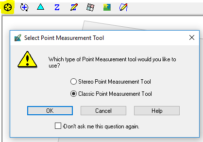 |
| Figure : Start Select Point Measurement Tool. |
 |
| Figure : Set coordinate system for GCPs using the Reset Horizontal Reference Tool. |
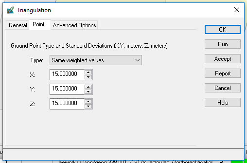 |
| Figure : Establish triangulation parameters. |
 |
| Figure : Add GCPs to the reference and input image using the Create Point Tool. |
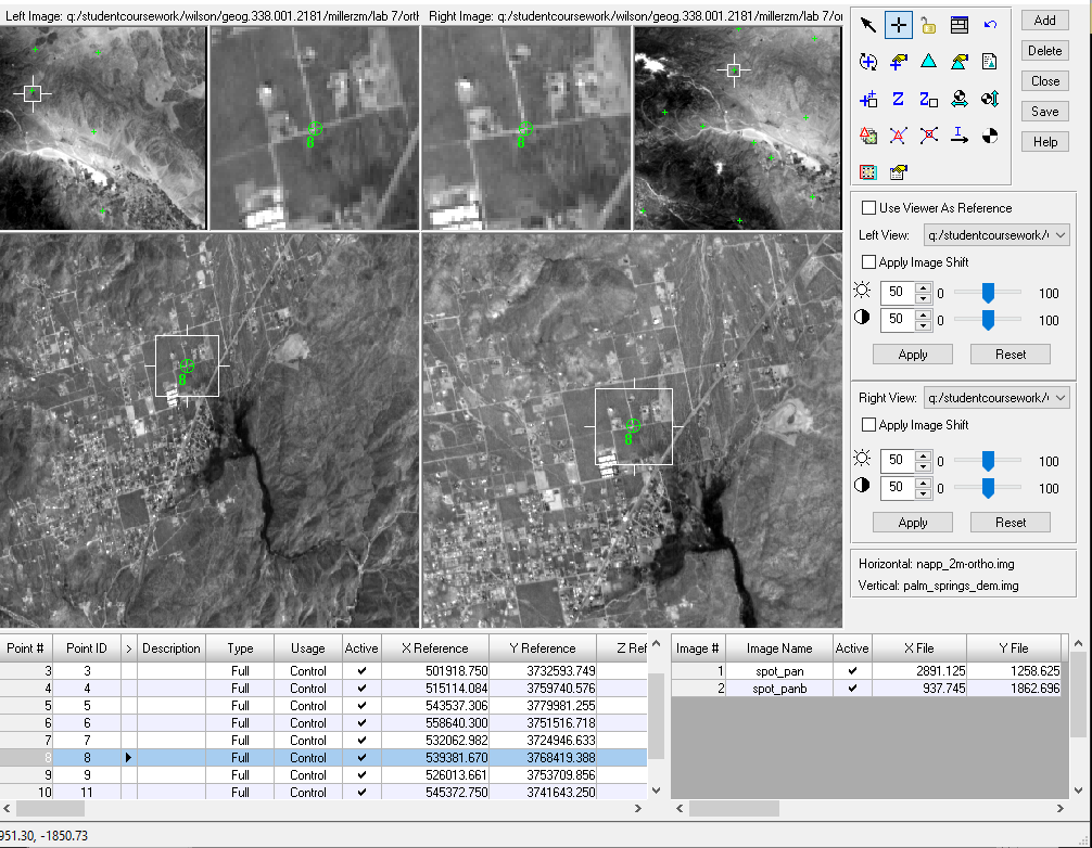 |
| Figure : View of overlapping points of the two images after being geometrically corrected. |
Then, the GCPs were stitched together using the Automatic Tie Point Generation Properties tool.
 |
| Figure : Auto Tie Summary showing results of the image tying. |
Results
 |
| Figure : |

The image above represents the two images before orthorectification. Having no spatial reference, the images would lay on top of each other if put into the same viewer and were the same size. After orthorectifying the images, the two images are merged together seamlessly and spatially accurate.
 |
| Figure : A zoomed-out view of the orthorectified images. |
Saturday, November 25, 2017
Lab 6: Geometric Correction
Introduction
The purpose of this lab was to work with and understand geometric correction of rasters. To do this, ERDAS Imagine was used in accordance with a dataset containing multispectral and USGS images and references of Chicago and Sierra Leone.
Methods
In order to achieve the initiatives outlined in the previous section, it was important to understand how geometric correction worked before preforming this action on imagery. In the first part of this lab, a multispectral image of the Chicago area was corrected using a USGS rendering as a reference. Only three ground control points (GCPs) were required since a first-order transformation (figure 1) was used.
The order of transformation directly relates to the amount of GCPs required for correction, as the averaging becomes more complex and accurate. Using the Multipoint Geometric Correction tool (figure 2) a dialog window opened allowing the geometric process to commence.
When the dialog window opened, a Polynomial Geometric Model was set to ensure 3 GCPs were used in first-order transformation. Then, by clicking the Create GCP button in the dialog window (figure 3), a point was selected in both the multispectral image and the reference map (figure 4).
As seen in figure 4, when initially locating the points, they were a bit different between the two images. This was corrected by moving the points around either window until a Control Point Error (bottom right of figure 4) of > 0.5 pixel was achieved. Once the images had accurate GCPs, the geometric correction was performed by creating an output file for the image, setting the resampling method to Nearest Neighbor, and prompting the dialog window to run the calculations based on the GCPs placed in the images (figure 5).
In the second part of this lab, geometric correction was performed on a different set of images, this time, two multispectral images of an area in Sierra Leone. One image is quite distorted while the other is geometrically correct, this will serve as a reference for the first image. Following a similar procedure as the previous part, the warped image viewer was selected and the Multipoint Geometric Correction tool was used to add a minimum of nine GCPs to the images. The number of GCPs required for this part was due to the use of a third-ordered transformation.
When calculating the geometric correction for these images, Bilinear Interpolation was used instead of Nearest Neighbor. Due to the large amount of GCPs used and a desire to preserve as much shape of the reference image as possible, this method was chosen this time around.
Results
Conclusion
Looking at the geometrically corrected images in the results section (figures 8 and 10 respectively), the transformations look vastly different. In the corrected Chicago image (figure 8), the changes are slight. It appears as though the image is almost pushed further away from the viewer, more of Lake Michigan and the southwestern corner of Illinois. The corrected image also appears to pixelate sooner than the original image, so the correction appears to preserve shape while distorting spatial resolution.
As for the second geometrically corrected image (figure 10), similar results to the first part are generated. The image appears further away and the color brilliance/ spatial resolution appears diminished. The size and shapes of features in the corrected image are incredibly close to those of the reference image, however. Perhaps in a professional setting, the two images could be used in accordance with each other to analyze features.
Overall, the geometric correction of multispectral imagery can provide a much more spatially accurate image for remote sensing applications. The process of geometric correction was fairly easy to complete in ERDAS Imagine as the prompts essentially only required input images, GCPs, and a resampling method to correct imagery. The image with more GCPs appeared to be more geometrically accurate than the first corrected image which only used 4 GCPs.
The purpose of this lab was to work with and understand geometric correction of rasters. To do this, ERDAS Imagine was used in accordance with a dataset containing multispectral and USGS images and references of Chicago and Sierra Leone.
Methods
In order to achieve the initiatives outlined in the previous section, it was important to understand how geometric correction worked before preforming this action on imagery. In the first part of this lab, a multispectral image of the Chicago area was corrected using a USGS rendering as a reference. Only three ground control points (GCPs) were required since a first-order transformation (figure 1) was used.
 |
| Figure 1: Differences of ordered polynomial transformations. |
 |
| Figure 2: Add control points tool. |
 |
| Figure 3: Create GCP button in Geometric Correction dialog window. |
 |
| Figure 4: GCP #4 shown in both maps. |
 |
| Figure 5: Complete geometric correction. |
In the second part of this lab, geometric correction was performed on a different set of images, this time, two multispectral images of an area in Sierra Leone. One image is quite distorted while the other is geometrically correct, this will serve as a reference for the first image. Following a similar procedure as the previous part, the warped image viewer was selected and the Multipoint Geometric Correction tool was used to add a minimum of nine GCPs to the images. The number of GCPs required for this part was due to the use of a third-ordered transformation.
 |
| Figure 6: Adding GCPs to Sierra Leone images. |
Results
 |
| Figure 7: Geometrically corrected multispectral image (Part 1). |
 |
| Figure 8: Original multispectral image (Part 1). |
 |
| Figure 9: Original multispectral image (Part 2). |
 |
| Figure 10: Geometrically corrected multispectral image (Part 2). |
Conclusion
Looking at the geometrically corrected images in the results section (figures 8 and 10 respectively), the transformations look vastly different. In the corrected Chicago image (figure 8), the changes are slight. It appears as though the image is almost pushed further away from the viewer, more of Lake Michigan and the southwestern corner of Illinois. The corrected image also appears to pixelate sooner than the original image, so the correction appears to preserve shape while distorting spatial resolution.
As for the second geometrically corrected image (figure 10), similar results to the first part are generated. The image appears further away and the color brilliance/ spatial resolution appears diminished. The size and shapes of features in the corrected image are incredibly close to those of the reference image, however. Perhaps in a professional setting, the two images could be used in accordance with each other to analyze features.
Overall, the geometric correction of multispectral imagery can provide a much more spatially accurate image for remote sensing applications. The process of geometric correction was fairly easy to complete in ERDAS Imagine as the prompts essentially only required input images, GCPs, and a resampling method to correct imagery. The image with more GCPs appeared to be more geometrically accurate than the first corrected image which only used 4 GCPs.
Wednesday, November 8, 2017
Lab 5: LiDAR Remote Sensing
Introduction
The purpose of this lab was to become familiar with using LiDAR (light detection and radar) data for remote sensing applications. Using ERDAS Imagine and ArcMap to visualize the point cloud information.
Methods
Using a folder containing 40 lidar data files, the quarter section tile data was brought into ERDAS Imagine to visualize them as point cloud data. The files were exported to a project folder as .las (point cloud tiles) files.
Once the files LAS as Point Cloud files were saved, an LAS Dataset was created in ArcMap. This was done by adding the point cloud files to the LAS dataset prompt and calculating statistics about the data comprising the files.
This calculation returned information regarding the highest and lowest Z-values (elevation) of the study area's returns, and classified the return values. The dataset was projected into a horizontal and vertical coordinate system since the point cloud data contained X,Y, and Z coordinates.
The dataset was then used in ArcMap to visualize the point cloud in various ways. By navigating to the symbology tab within the dataset layer properties, the number of classes, which returns, colors, and other parameters were configured to visualize the dataset for different applications.
Using the LAS Toolbar was helpful in interpreting various components of the dataset. The profile tool was especially helpful in determining false return points within the point cloud.
Next, a Digital Surface Model, Digital Terrain Model, and corresponding Hillshades were created using the dataset. To achieve this, the LAS Dataset to Raster tool was used, adjusting different components within the prompt to display surface or terrain.
Lastly, an Intensity Image was created using the intensity values within the dataset instead of elevation values. The image was then brought into ERDAS Imagine for better visualization.
Results
Discussion
I found the lidar visualization skills learned in this assignment were interesting and beneficial. Having never worked with a lidar dataset before this assignment, I now feel more confident in my ability to work with these types of datasets. Of course, this lab covered basic functionalities and visualization techniques for lidar datasets, however, lidar now seems more exciting and useful of a technology for visual interpretation, land use/land cover, and other remote sensing applications than satellite imagery. There are benefits to using either technology and, in some cases, could be used in accordance with one another. LiDAR datasets are indeed more versatile than satellite imagery, due to their Z coordinate values, return layers, and profile viewing capabilites alone- you just can't get that level of 3-dimensional information with satellite imagery.
The purpose of this lab was to become familiar with using LiDAR (light detection and radar) data for remote sensing applications. Using ERDAS Imagine and ArcMap to visualize the point cloud information.
Methods
Using a folder containing 40 lidar data files, the quarter section tile data was brought into ERDAS Imagine to visualize them as point cloud data. The files were exported to a project folder as .las (point cloud tiles) files.
 |
| Figure 1: Add .las files to ERDAS Imagine. |
Once the files LAS as Point Cloud files were saved, an LAS Dataset was created in ArcMap. This was done by adding the point cloud files to the LAS dataset prompt and calculating statistics about the data comprising the files.
 |
| Figure 2: Create new LAS dataset in ArcMap. |
 |
| Figure 3: Add files to LAS dataset in ArcMap. |
This calculation returned information regarding the highest and lowest Z-values (elevation) of the study area's returns, and classified the return values. The dataset was projected into a horizontal and vertical coordinate system since the point cloud data contained X,Y, and Z coordinates.
 |
| Figure 4: Choose horizontal coordinate system for LAS dataset. |
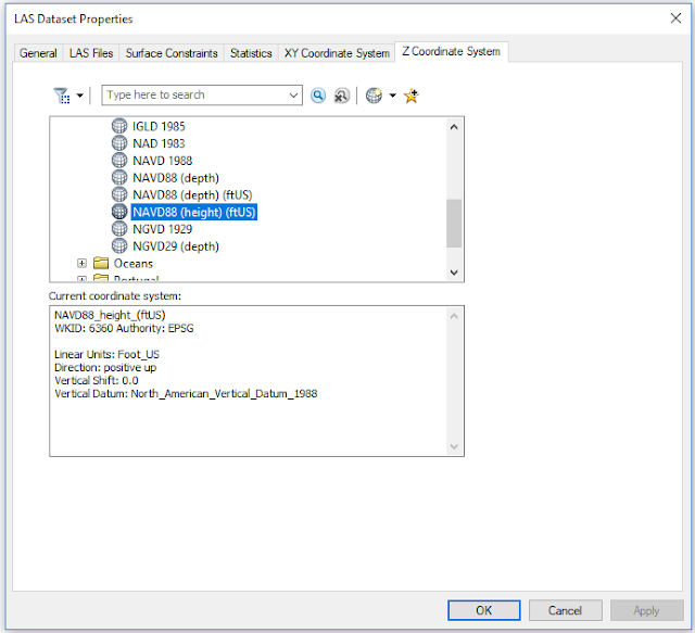 |
| Figure 5: Choose vertical coordinate system for LAS dataset. |
The dataset was then used in ArcMap to visualize the point cloud in various ways. By navigating to the symbology tab within the dataset layer properties, the number of classes, which returns, colors, and other parameters were configured to visualize the dataset for different applications.
 |
| Figure 6: Visualizing the lidar point cloud in ArcMap. |
 |
| Figure 7: Using the profile tool in ArcMap. |
Next, a Digital Surface Model, Digital Terrain Model, and corresponding Hillshades were created using the dataset. To achieve this, the LAS Dataset to Raster tool was used, adjusting different components within the prompt to display surface or terrain.
 |
| Figure 8: Using LAS Dataset to Raster tool in ArcMap to create a Digital Terrain Model (DTM). |
 |
| Figure 9: Using LAS Dataset to Raster tool in ArcMap to create a Digital Surface Model (DSM) using the first return of point cloud. |
Lastly, an Intensity Image was created using the intensity values within the dataset instead of elevation values. The image was then brought into ERDAS Imagine for better visualization.
Results
 |
| Figure 10: Digital Surface Model result. |
 |
| Figure 11: Digital Terrain Model result. |
 |
| Figure 12: Intensity image result. |
Discussion
I found the lidar visualization skills learned in this assignment were interesting and beneficial. Having never worked with a lidar dataset before this assignment, I now feel more confident in my ability to work with these types of datasets. Of course, this lab covered basic functionalities and visualization techniques for lidar datasets, however, lidar now seems more exciting and useful of a technology for visual interpretation, land use/land cover, and other remote sensing applications than satellite imagery. There are benefits to using either technology and, in some cases, could be used in accordance with one another. LiDAR datasets are indeed more versatile than satellite imagery, due to their Z coordinate values, return layers, and profile viewing capabilites alone- you just can't get that level of 3-dimensional information with satellite imagery.
Friday, October 27, 2017
Lab 4: Miscellaneous Image Functions
Introduction
The purpose of this lab was to become familiar with various image functions when using ERDAS Imagine. By manipulating and otherwise viewing the different function workflows, understanding the concepts of these image functions was much easier than say reading about them. Whatever the project, whatever the dataset, image functions can help to correct poor imagery for the job.
Methods
Part 1: Image Subsetting
Image subsetting refers to the creation of an area of interest when studying imagery. An inquire box refers to one method of subsetting, where a rectangular box is placed in the imagery. The second type of subsetting is creating an Area of Interest (AOI) in which the user creates a more specific shape as their subset by using a shapefile, or digitizing the area for example.
Section 1 - Inquire Box
An inquire box was used first. To do this, ERDAS Imagine was opened and a raster layer was added to the viewer. Then, Inquire Box was selected from the right-click pop up menu (figure 1).
Then, an inquire box was drawn around the Chippewa valley by clicking in the top left corner of the AOI and dragging until the area was sufficiently covered. From there, the raster tab on the software banner was clicked and Subset & Chip > Create Subset Image was chosen- a pop-up window appeared. A output folder and name for output file were created and the From Inquire Box was selected- changing the coordinates of the subset definition. The tool was run and created a defined inquire box subset of the original image (figure 2).
Section 2 - Area of Interest
As shown in figure 10, the Google Earth tab was navigated to and the highlighted Connect to Google Earth button was clicked. This action opened Google Earth in another viewer, splitting the software as shown in figure 12. The Link GE to View button was then clicked to synchronize the two viewers (figure 11).
Part 5: Resampling Imagery
Once the viewer was set up, it was time to use the first mosaic tool- Mosaic Express.
The highlighted folder icon near the left center of figure 18 was used to select the two images (the same as the ones in figure 16). For this resampling method, Nearest Neighbor was used.
The rest of the parameters in the window were accepted and a name for the output file was created on the last page of the Mosaic Express window (figure 19). The result is shown below:
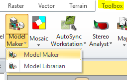
To utilize this equation, the banner tab Toolbox > Model Maker > Model Maker button was selected, opening a blank model (figures 30 and 31).
For one image, the 2011 near infrared (NIR) band image was used. The other, used the 1991 NIR band image. The function object (circle shown in figure 31) subtracted the 2011 image from the 1991 image and added the constant of 127 (see figure 32).
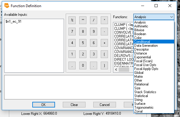
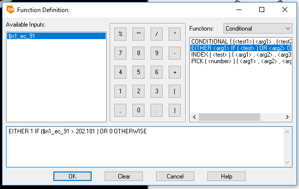
The output raster was given a name and the model was ran (click the red lightning bolt shown in figure 31). The resulting image's metadata was used for the next part of this section. A new model was created in the same way as the previous, however this time, there was only one input raster (the one just created), one function object operator, and one output raster. The function object operator was double-clicked and the function definition window popped up, under Functions: Conditional was chosen (figure 33). The function object operation for this model is shown in figure 34.
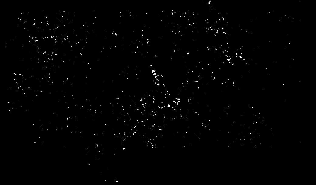
The 202.181 shown in figure 34's function was found by taking the mean value from the difference image's histogram information and adding 3 times (x) standard deviation taken from the difference image. The model was ran and produced the following image (figure 35).
This image wasn't very easy to work with and/or analyze, so the image was brought into ArcMap to be symbolized a bit better. The result is displayed below (figure 36).
Results/Discussion
The purpose of this lab was to become familiar with various image functions when using ERDAS Imagine. By manipulating and otherwise viewing the different function workflows, understanding the concepts of these image functions was much easier than say reading about them. Whatever the project, whatever the dataset, image functions can help to correct poor imagery for the job.
Methods
Part 1: Image Subsetting
Image subsetting refers to the creation of an area of interest when studying imagery. An inquire box refers to one method of subsetting, where a rectangular box is placed in the imagery. The second type of subsetting is creating an Area of Interest (AOI) in which the user creates a more specific shape as their subset by using a shapefile, or digitizing the area for example.
Section 1 - Inquire Box
An inquire box was used first. To do this, ERDAS Imagine was opened and a raster layer was added to the viewer. Then, Inquire Box was selected from the right-click pop up menu (figure 1).
 |
| Figure 1: Inquire Box |
 |
| Figure 2: Chippewa Valley Inquire Box Subset. |
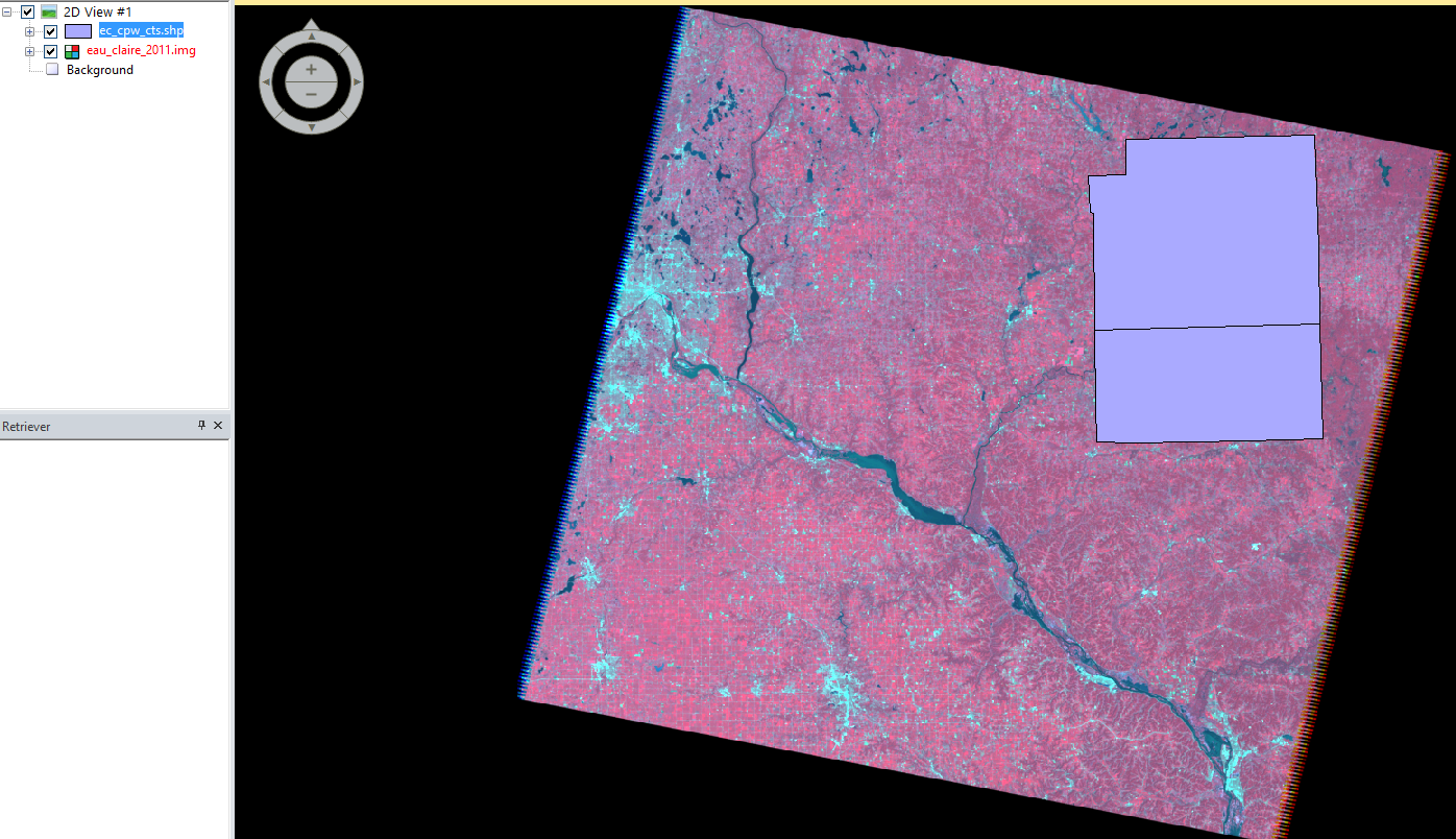
This method started the same way as the last; by bringing in a raster file in a new viewer. Then, a shapefile was added. This was done by right-clicking in the viewer and choosing Open Vector Layer (figure 3). An add layer window was opened and shapefile was selected from the Files of Type selector. A shapefile (.shp) containing Eau Claire and Chippewa counties was used as an overlay (figure 4).
 |
| Figure 3: Add vector layer. |
 |
| Figure 4: Shapefile overlay. |
Next, the two counties were selected by holding down the Shift key and clicking on each shape. Then, the banner tab Home > paste from selected object were clicked. Next, File > Save As > AOI Layer As was selected to save the shape as an Area of Interest file. Once this was done, the same procedure as section 1 of part 1 was used, only this time the saved AOI file was used as the subset instead of the Inquire Box. A subset of Eau Claire and Chippewa counties was created (figure 5).
Part 2: Image Fusion
 |
| Figure 5: Eau Claire and Chippewa counties subset. |
Part 2: Image Fusion
Image fusion refers to the manipulation of an image's spatial resolution. This can be done using Pan Sharpening tools in ERDAS, which takes the spatial resolution of an image and merges it with another- this is called a Resolution Merge.
To complete the resolution merge, a 15-meter panchromatic image and a 30-meter reflective image were brought in ERDAS as two separate viewers. Then, the banner tab Raster > Pan Sharpen > Resolution Merge was clicked (figure 6).
The parameters for the resolution merge are shown in figure 7. The panchromatic image was the set to the High Resolution Input File and the reflective image was set to the Multispectral Input File. The output file was given a name and location, Multiplicative method and Nearest Neighbor Resampling Technique were chosen. The pan-sharpened image was created and used to compare with the reflective image.
Part 3: Simple Radiometric Enhancement
The Radiometric Resolution of an image refers to the amount of value variation visible in the image based on bit-size. Sometimes, due to atmospheric haze, an image's value variance is diminished. To correct this, the radiometric tool Haze Reduction was used.
By opening a reflective image in an ERDAS viewer and selecting Radiometric > Haze Reduction under the Raster tab, a haze reduction window opened (figure 8).
A name for the output image was chosen and the result is shown on the right side of figure 9. It is clear to see the effect of color contrast and variance between the two images.
 |
| Figure 6: Begin resolution merge. |
 |
| Figure 7: Resolution merge window. |
Part 3: Simple Radiometric Enhancement
The Radiometric Resolution of an image refers to the amount of value variation visible in the image based on bit-size. Sometimes, due to atmospheric haze, an image's value variance is diminished. To correct this, the radiometric tool Haze Reduction was used.
By opening a reflective image in an ERDAS viewer and selecting Radiometric > Haze Reduction under the Raster tab, a haze reduction window opened (figure 8).
 |
| Figure 8: Haze Reduction window. |
 |
| Figure 9: Haze Reduction Result. |
Part 4: Linking ERDAS Viewer to Google Earth
When interpreting aerial imagery, it can be difficult to determine what certain shapes and objects are. It's helpful to reference other viewpoints to make those determinations; whether it be going to the place, or the second best option is utilizing a 3-D viewer like Google Earth to obtain annotation information as well as oblique and ground-level views of places.
 |
| Figure 10: Begin connecting to Google Earth. |
 |
| Figure 11: Linking ERDAS Viewer with Google Earth. |
 |
| Figure 12: Synchronized split view (ERDAS Viewer left, Google Earth right). |
Part 5: Resampling Imagery
Resampling imagery refers to rendering the pixel size of an image differently than it was originally produced to enhance the spatial resolution of an image. In this part of the lab, two different resampling techniques were used on the same original image: Nearest Neighbor and Bilinear Interpolation.
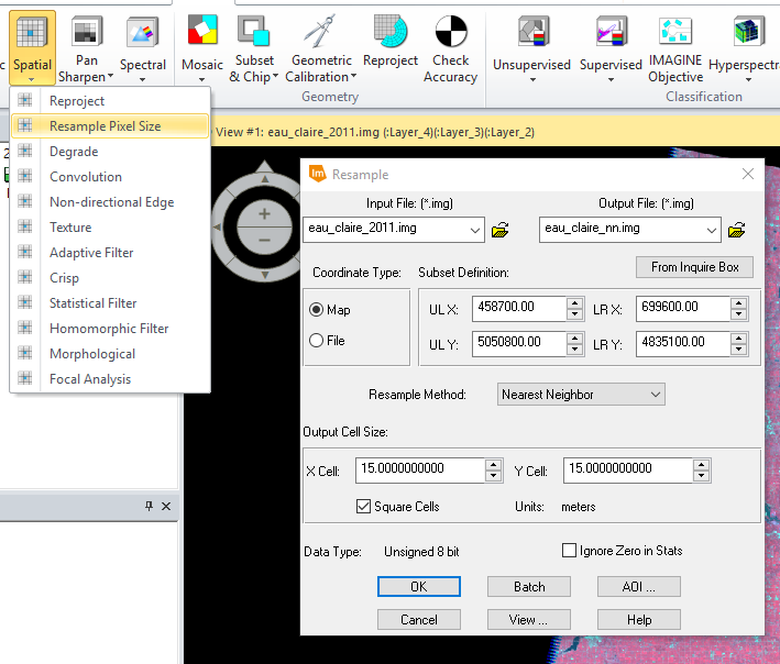
First, a 30 meter reflective image was brought into the ERDAS viewer and the Raster banner tab was clicked to open the raster tools. Next, Spatial > Resample Pixel Size tool was used (figure 13).
In figures 13 and 14, the Output Cell Sizes were set to 15 Meters and Square Cells was checked. The two outputs varied slightly as each employed a different resampling method.
First, a 30 meter reflective image was brought into the ERDAS viewer and the Raster banner tab was clicked to open the raster tools. Next, Spatial > Resample Pixel Size tool was used (figure 13).
 |
| Figure 13: Using Nearest Neighbor Resampling. |
 |
| Figure 14: Using Bilinear Interpolation Resampling. |
Part 6: Image Mosaicking
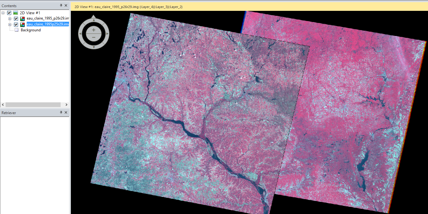
Mosaicking refers to merging two or more overlapping images for analysis/interpretation. The goal of mosaicking is to create a seamless transition along the border of the two images. Two different mosaicking methods were used in this part of the lab: Mosaic Express and MosaicPro, both of which are ERDAS tools.
To begin, two raster layers were added to the viewer. This was done by adding a raster layer like normal, except this time, before clicking OK and adding a single image to the viewer, the Multiple tab in the Select Layer to Add window is clicked along with the Multiple Images in Virtual Mosaic option (see figure 15). The second image was added and the viewer looked like figure 16.
 |
| Figure 15: Add multiple images window. |
 |
| Figure 16: Add multiple images viewer. |
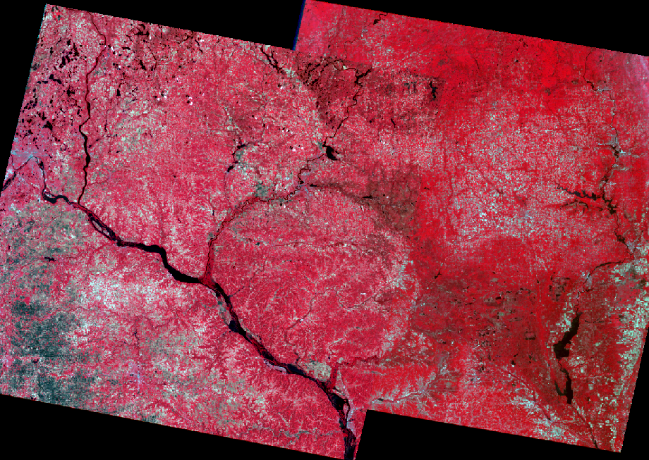
Section 1 - Mosaic Express
The Mosaic > Mosaic Express button under the Raster banner tab was clicked and a pop-up window opened (see figures 17 and 18).
 |
| Figure 17: Open Mosaic Express tool. |
 |
| Figure 18: Mosaic Express window. |
 |
| Figure 19: Finishing Mosaic Express. |
 |
| Figure 20: Mosaic Express output. |
Section 2 - MosaicPro
For this section of part 6, the same start-up conventions were used only this time, MosaicPro was used instead of Mosaic Express (see figure 21).
Once the application was opened, the images were added (figure 22). The Image Area Options tab was selected and the Compute Active Area button clicked. This same method was used for the second image and two image outlines were displayed in the viewer.
Next, the Color Corrections icon in the application banner was clicked and Histogram Matching option was used.
Once the Use Histogram Matching option was checked, the Set... button became available (figure 23). The histogram matching parameters window opened and the Matching Method was set to Overlap Areas (figure 24).
Section 2 - Mapping change pixels in difference image using Modeler
For this section of part 6, the same start-up conventions were used only this time, MosaicPro was used instead of Mosaic Express (see figure 21).
 |
| Figure 21: MosaicPro tool. |
 |
| Figure 22: Display Add Images Dialog button (highlighted blue page button with arrow). |
 |
| Figure 23: Color corrections window (icon displayed as highlighted on banner). |
 |
| Figure 24: Set Histogram matching method. |
After setting all of the parameters, the Run Mosaic button was clicked (figure 25) and the resulting mosaicked image was generated (figure 26).
Part 7: Binary Change Detection - Image Differencing
 |
| Figure 25: Run MosaicPro tool. |
 |
| Figure 26: Results of MosaicPro. |
Part 7: Binary Change Detection - Image Differencing
Binary change detection a.k.a. image differencing, refers to the comparison of two images when attempting to map change of an area. For this part of the lab, the goal was to create a differenece image and map the binary results.
Section 1 - Create a difference image
First, two images were brought into separate ERDAS viewers. One was an image of the Eau Claire area taken in 1991 and the other was the same area, but was taken in 2011- a 20-year difference between the two images. At a quick glance, there weren't many noticeable areas of change. When image differencing is used, however, the changes become very noticeable as the tool creates a binary change output (either any given area changed or didn't).
From the Raster banner tab in ERDAS, Functions > Two Image Functions was selected and a Two Input Operators pop-up window opened (figure 27).
 |
| Figure 27: Two Image Functions - Two Input Operators. |
The 2011 image was selected as Input File #1 and the 1991 image as Input File #2. Each of these images used layer 4 as their input layer. The output file was given a name and, under the Output Options section, the Operator was set to - and the Select Area By: Union option was chosen. The tool was run creating the output histogram shown in figure 28.
 |
| Figure 28: Change vs no change threshold (anything outside the blue lines is classified as having changed). |
Section 2 - Mapping change pixels in difference image using Modeler
Once the difference image was created, it was time to create a model to rid negative difference values and create an image to display change pixels. The equation for this initiative is shown in figure 29.
 |
| Figure 29: Change pixel equation. |
 |
| Figure 30: Open Model Maker. |
 |
| Figure 31: New model with input and output rasters (multiple layers shape), and operation controls (circle). |
 |
| Figure 32: Function object operation. |
 |
| Figure 33: Choose conditional functions. |
 |
| Figure 34: Defining binary difference function. |
 |
| Figure 35: Binary difference image result. |
 |
| Figure 36: Binary change map. |
Part 1 - Section 1: I thought the Inquire Box was a good tool to define an area of interest when there isn't a need to digitize the exact AOI and/or there isn't a shapefile of the AOI readily available. For quick analysis of a general area, this is a good method.
Part 1 - Section 2: I thought the AOI was a good tool to not only create a subset, but actually define the AOI when a shapefile was accessible. Overall, either the Inquire Box or AOI could be used to create a good subset.
Part 2: I found the pan-sharpening a bit confusing as I didn't really see much of a difference in the results from the original image. I also expected the output to be a sharpened image of the multispectral image not the panchromatic image.
Part 3: I think the haze reduction function could be really beneficial in image interpretation/analysis. Because color variance is so important in these two areas, this function does a good job of correcting hazy imagery and defining more colors.
Part 4: Linking ERDAS Imagine viewer and Google Earth is a great tool to use for image classification. By having access to a 3-D and ground level viewer within the same interface could streamline the image classification process, not to mention the views can be synchronized!
Part 5: I didn't quite grasp the utility of this function. I understand the difference between Nearest Neighbor and Bilinear Interpolation methods, however the difference between the two results wasn't very noticeable to me. I'm sure that there are good uses for either resampling method, I just couldn't distinguish them.
Part 6 - Section 1: The Mosaic Express tool was terrible, as shown in figure 20, the tool hardly mosaicks the images together and quite honestly defeats the purpose of mosaicking.
Part 6 - Section 2: The MosaicPro tool proved to be a much better way to mosaic images. As shown in figure 26, the color correction between the images is much better and the border, while still visible, is far closer to being seamless than the result of Mosaic Express.
Part 7 - Section 1: This section was a bit confusing to me, because the output difference image didn't look too different than either of the input images. When we used the resulting histogram for the mean and standard deviation values, I understood the purpose of this step.
Part 7 - Section 2: I found this tool to be very interesting and useful. Having the binary results can greatly help as a reference for reclassification.
Part 7 - Section 2: I found this tool to be very interesting and useful. Having the binary results can greatly help as a reference for reclassification.
Subscribe to:
Comments (Atom)